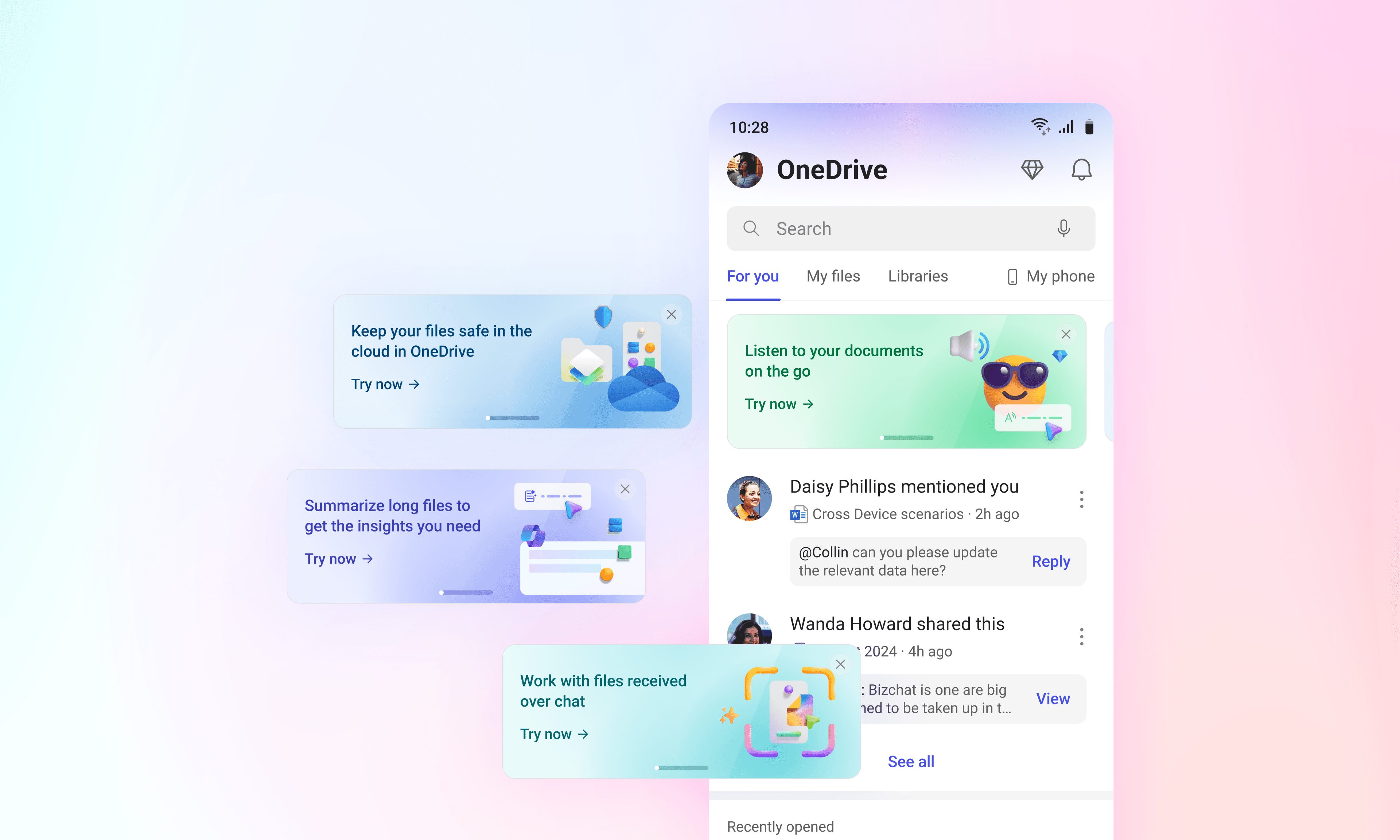
Promo cards
Teaching users the full potential of productivity in Microsoft 365 Mobile
role
Lead Product Designer
responsibilities
End-to-end UX & Strategy
timeline
Mar '23 – Dec '23
collaborators
Engineering, PM (Consumption), Data Science, QA
tl;dr
Microsoft 365 Mobile was mid-redesign, but users still thought it was just “Office on a phone.” Cool new stuff like Microsoft Designer was basically invisible. We tried the usual discovery tricks, but they were either annoying, blocking, or impossible to scale. So I built a visually delightful promo card framework that made feature discovery feel natural. It hit 25% CTR and drove a ~500% average lift in hero feature usage, then expanded across tabs.
This is a container div
This page is basically wrapping around a Figma file. If you scroll, you’ll find the full case study in its natural habitat, complete with interactions and details I probably didn’t need to include.
Presentation
Note: Full-screen experience recommended.
Click anywhere in the deck or use arrow keys to navigate.
Press R to reset prototype.
Impact
A pretty card is irrelevant if it doesn’t change behavior. In our pilot and rollout, the promo cards consistently turned curiosity into increased launches and repeat usage.
25%
click through rate
1 in 4 people tried a featured capability.
40%
of Designer launches
Nearly half of Designer opens in the pilot.
+500%
avg. MAU lift
Sharp increase of usage for promoted flows.
A small lesson I keep reusing
Discovery only works when it feels earned. This project was a reminder that the best growth surfaces are the ones that avoid 'marketing' and feel natural within the product.